“When UX doesn’t consider ALL users, shouldn’t it be known as ‘SOME User Experience’ or… SUX?”
– Billy Gregory, Digital Accessibility Professional
Visualize this – you are in a garden, enjoying the nature around you. What did you think of? Beautiful blue sky, green grass, and colorful flowers? Now visualize the same world in muted colors – grey sky, grey grass, and not-so colorful flowers. This is exactly how some people with color blindness see everything around them. But not being able to enjoy the different colors of nature is not the biggest challenge a color-blind person faces.
Imagine another scenario where you are at a supermarket, buying groceries. You pick up a packaged food item and want to check if it is vegetarian or non-vegetarian. What do you do? You check for the green or brown symbol on the package. You then go to the fruits section and try to pick a ripe banana. You know you have to pick the yellow one as it is ripened, and not the green one. Then, you get into your car to drive back home but the traffic signal on the way is red. So, you stop and wait for it to turn green. Sounds like an everyday situation we face, right? But what would be the situation if we could not distinguish between these colors? There was no way to find out if the packaged food was veg or non-veg or what was the color of the traffic light. This is why we need accessible and inclusive designs. And accessibility and inclusivity are more than just adding an ‘others’ option in the gender section of a form.
What is Accessible and Inclusive Design?
Accessible and Inclusive design is not a different type of design process. It is just an approach and a series of practices that intentionally include and enable users who have a permanent, situational, or temporary disability or experience discrimination due to being part of a minority or oppressed group. It is about adding an extra dimension of inclusion to the existing design thinking process. At its core, accessible and inclusive design is about empathizing with users and adapting interfaces to address the various needs of those users.
With the ever-increasing internet reach, everyone is producing content and products that instantly have a global reach. With that power comes the responsibility to ensure that these products are accessible, inclusive, and respectful of their global audiences’ diverse requirements and social identities. Here are some statistics for people who might be skeptical about why it matters:
- Over 1 billion people – about 15% of the world’s population live with some form of disability
- 44% of consumers worldwide feel they are not fully represented by the people they see in ads
- 49% of Gen-Z consumers, in the US, stopped purchasing from a brand that did not represent their values
- Around 300 million people globally have color vision deficiency
- Approximately 1 in 12 men (8%) and 1 in 200 women (0.5%) have color blindness
Digital interfaces that do not prioritize accessible and inclusive design can negatively impact the user experience of such a large audience.
Learning about Different Abilities
Mostly, people tend to categorize everyone into two groups when it comes to ability: Abled and disabled. But if we really think about it, everyone is just on different areas of the spectrum of ability. Some people can see everything clearly, some might need glasses, some might not be able to see some specific colors while others might not be able to see anything at all. Some can stand or walk without any difficulty, some might walk with a limp, some might need walking aids like crutches, and others might need a wheelchair. And it is just a matter of time before we change our position on this spectrum. Getting an eye check-up can dilate your pupils and leave you with temporary blurry vision or an injury on your leg can put you on temporary crutch support. Even with age, our abilities start to deteriorate. Hence, it is important to understand and learn about users of all backgrounds and abilities.
Color blindness (color vision deficiency, or CVD) is a common term used for the condition where individuals are not blind but just confuse shades or lose their ability to distinguish between different colors. This condition is caused due to defects in the cells of the eyes and the type and severity of these defects determine the type of color blindness. Different types of color blindness are:
1. Red-green color blindness
This is the most common type of color blindness which makes it difficult to tell the difference between red and green. There are 4 types of red-green color blindness: Deuteranomaly, Protanomaly, Protanopia, Deuteranopia
People who are red-green color blind are often surprised to find out that peanut butter is NOT green!
2. Blue-yellow color blindness
This type of color blindness makes it difficult to tell the difference between blue and green, and between yellow and red. There are 2 types of blue-yellow color blindness: Tritanomaly, and Tritanopia.
3. Complete color blindness
This type of color blindness is quite uncommon and is also called monochromacy. It takes away your ability to see colors at all and can also make you more sensitive to light.
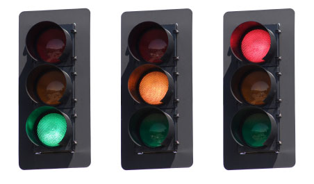
Figure 1: Traffic Lights – Normal Vision
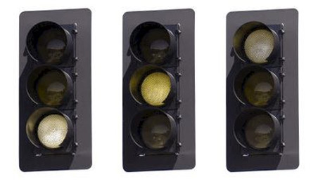
Figure 2: Traffic Lights – Protanopia (type of red-green color blindness)
Basic Considerations for Accessible and Inclusive Design
Some practices that can lead to accessible and inclusive design solutions are:
- Working with the right team: Building a diverse team who have a multitude of identities and abilities helps in overcoming unconscious bias and exclusion behaviors.
- Educating stakeholders: Engaging stakeholders in research, sharing examples, and explaining to them how different people use technology is essential.
- Involving users: Using user research and co-creation to deliver to excluded communities, as designing with them is more important than designing for them.
- Establishing design guidelines: It is essential to have guidelines in place and follow them for every product design and development. There are some web accessibility guidelines published by the Web Accessibility Initiative of the World Wide Web Consortium which can be helpful.
Our design choices can inspire, motivate, connect, empower, and support users but can also alienate, offend, marginalize, misrepresent, and create barriers for them, which obviously is not a good user experience. Some design ideas to use are:
- Not relying on color codes alone to convey information and use texture, pattern, shapes, numbers, etc in designs instead.
- If color coding is required, being more intentional about what colors are paired together.
- Providing sufficient contrast between foreground text color and background color.
- Including text alternatives for non-text content like images and videos.
- Using images and copy that includes people from different backgrounds and abilities.
Utilizing tools like color blindness simulator, to test product designs and ensure their accessibility.
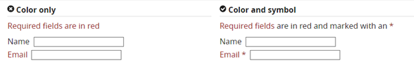
Figure 3: Accessible UX design
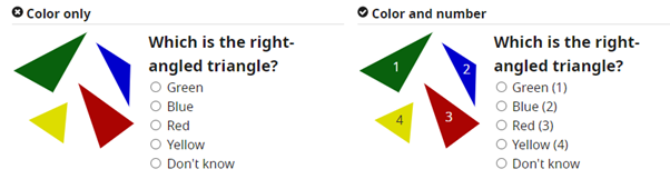
Figure 4: Increasing accessibility using numbers
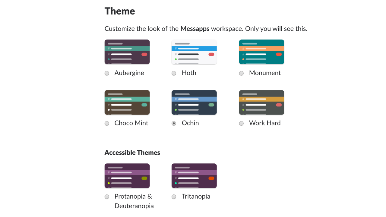
Figure 5: Accessible theme options
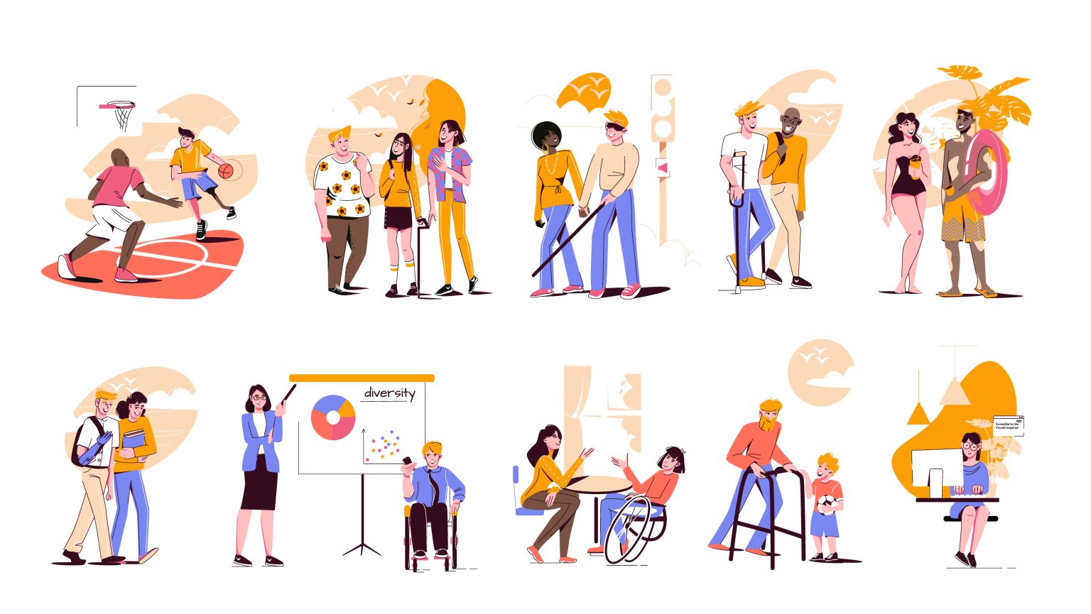
Figure 6: Using image that represents diversity
Conclusion
It’s long overdue for design thought leaders to normalize accessible and inclusive designs as foundational to design work instead of the occasional mention of it as a niche topic. We need to find ways and create designs and systems for people with all types of abilities to build empathy so that we do not end up serving them experiences that are any less than good.
References
- https://www.nngroup.com/articles/inclusive-design/
- https://www.colourblindawareness.org/colour-blindness/living-with-colour-vision-deficiency/
- https://www.nei.nih.gov/learn-about-eye-health/eye-conditions-and-diseases/color-blindness/types-color-blindness
- https://uxdesign.cc/a-beginners-guide-to-inclusive-ux-design-b8dcc94f5068
- https://www.w3.org/WAI
- freepik.com – Image by macrovector